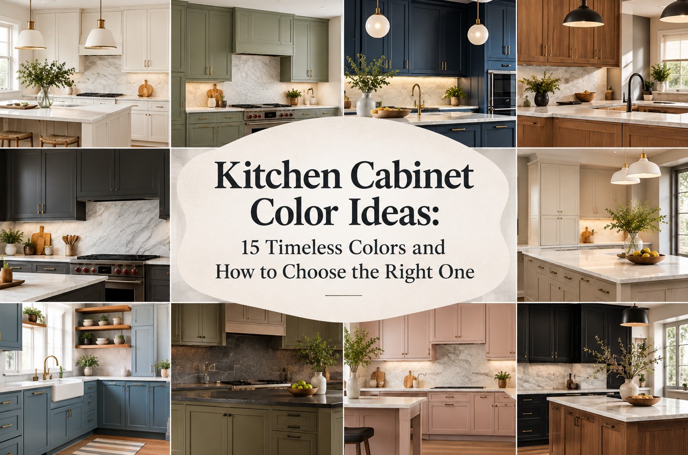
Looking for kitchen cabinet color ideas that feel current today and still look beautiful years from now? The best cabinet color is not simply the shade trending on social media. It is the one that works with your natural light, countertop, flooring, backsplash, architecture, and tolerance for upkeep. Because cabinets occupy so much visual space, their color sets the mood for the entire kitchen.
This guide compares 15 kitchen cabinet color ideas for American and Canadian homes, explains which shades work in small or north-facing rooms, and shows how to coordinate paint, wood grain, hardware, and stone. You will also find a practical sample-testing method, common mistakes to avoid, and answers to questions homeowners often ask before ordering custom cabinetry.
Quick Guide to Kitchen Cabinet Color Ideas
- For a bright, flexible kitchen: warm white, soft ivory, or light natural oak.
- For a warm contemporary look: mushroom, taupe, greige, or walnut.
- For a subtle color statement: sage, olive, or muted blue.
- For a dramatic island: deep navy, forest green, or charcoal.
- For a layered designer look: two-tone cabinets with one unifying undertone.
These kitchen cabinet color ideas are starting points, not strict rules. NKBA’s published 2026 trend findings point to continued interest in neutrals, greens, blues, and natural wood grain, but a trend report describes broad preferences—not a rule for every home. Choose a palette that suits your own space and materials.
15 Kitchen Cabinet Color Ideas Worth Considering
1. Warm White
Warm white gives a kitchen a clean, open appearance without the sharpness that some cool whites create beside wood or creamy stone. It works across transitional, classic, and modern interiors. Pair it with natural oak, brushed brass, warm nickel, or a backsplash with soft variation. Before choosing a white, compare its undertone with the countertop; two whites can look surprisingly different side by side.
2. Soft Ivory
Ivory introduces a little more warmth than a crisp white and can soften a kitchen with traditional detailing or veined natural stone. It often pairs well with walnut, warm metals, and beige or cream surfaces. Check the sample under both daylight and your planned LED lighting so the cabinets do not look yellow against a cooler countertop.
3. Greige
Greige sits between gray and beige, making it useful when the room contains both warm and cool finishes. It can provide contrast without the visual weight of dark cabinets. The exact balance matters: a greige with a pink undertone may clash with green-gray stone, while a more neutral version can connect several materials.
4. Mushroom and Putty
Mushroom and putty shades bring a soft, earthy quality to cabinetry. They work especially well with natural stone, textured tile, and understated hardware. These colors are nuanced, so test a large sample rather than relying on a tiny paint chip. Nearby wood and flooring can make the same shade appear warmer or cooler.
5. Natural White Oak
White oak adds grain and organic texture without relying on a painted color. Its appearance varies with cut, stain, clear coat, and the individual board, so request samples from the actual finish system. Oak pairs beautifully with warm whites, muted greens, and many stone surfaces. If upper and lower cabinets use different materials, repeat one finish elsewhere to make the combination feel intentional.
6. Light Maple
Maple generally offers a finer, more restrained grain than oak, which suits streamlined kitchens and smaller spaces. Its final color depends heavily on the finish and can shift over time with light exposure. Review the finished sample—not unfinished wood—and confirm how the cabinet maker controls variation between doors.
7. Walnut
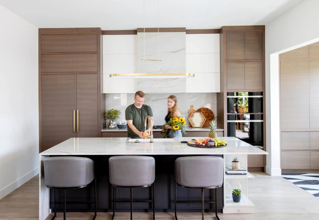
Walnut brings depth and visible natural character. It can anchor a bright kitchen as a full cabinet run or create a rich contrast on an island. Pair it with restrained counters and a coordinated backsplash so the grain remains a feature rather than competing with several other patterns. Ask to review multiple doors because natural wood varies from piece to piece.
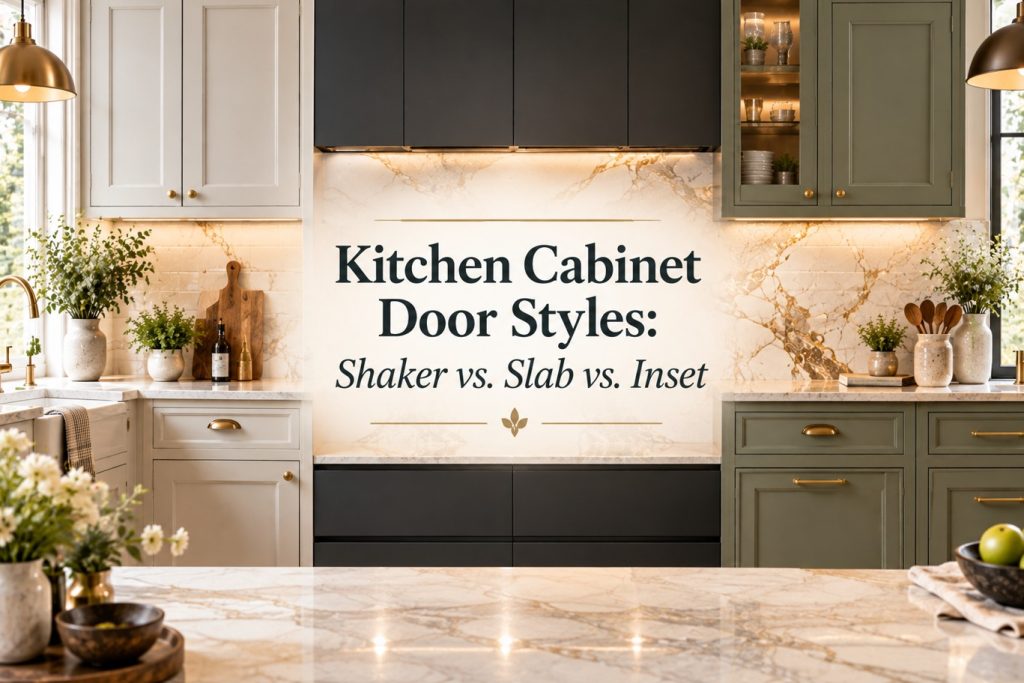
If you are comparing wood, painted, and slab-front options, use this guide to see how cabinet construction and door profile affect the final look.
8. Sage Green
Sage is a muted green that can feel calm rather than loud. It works on full cabinetry in a light-filled room or on lower cabinets beneath warm-white uppers. Natural oak, cream quartz, and brushed metal finishes can complement it. Sample carefully: green undertones can look gray, yellow, or blue depending on the light and surrounding materials.
9. Olive Green
Olive offers more depth and an earthy character. It can be effective on an island or lower cabinets, particularly when the kitchen includes warm wood and creamy stone. In a dim room, a dark olive may read nearly brown or black, so view the sample at different times of day before committing.
10. Forest Green
Forest green creates a confident, tailored look, especially with warm brass, natural wood, and light countertops. It is often easier to balance as a focal run or island than in a room with limited daylight and many dark finishes. Use the same green sample against the backsplash and counter to ensure the undertones work together.
11. Muted Blue
Muted blue can introduce color while remaining relatively restrained. It works well on islands or lower cabinets with warm whites and pale stone. Avoid choosing the paint in isolation: a blue that looks sophisticated on a sample card may feel overly cool next to blue-gray flooring or bright white lighting.
12. Navy
Navy adds contrast and formality. It can ground a large island or create a dramatic lower cabinet run while the upper cabinets stay light. Balance it with enough task lighting and a countertop that does not make the overall room feel too heavy. Fingerprints and dust may be more visible on some dark finishes, especially glossy ones.
13. Charcoal
Charcoal offers a modern alternative to pure black. Depending on its undertone, it can connect stainless steel, gray stone, and warm timber. Use it selectively in a compact or poorly lit kitchen, and compare matte and satin finishes because sheen affects how the color reads and how easily marks show.
14. Espresso Brown
Espresso cabinetry provides a rich, architectural mood and can make a large kitchen feel intimate. It benefits from layered lighting, lighter counters, and carefully chosen hardware. In a smaller room, consider using espresso on the island or a tall pantry wall rather than every cabinet face.
15. Two-Tone Cabinets
Two-tone cabinetry lets you combine a neutral base with a more expressive island or lower run. A reliable approach is to keep the larger cabinet area quiet and use the second color where it has a clear visual purpose. Repeat the accent color in a small detail, or connect the two tones through the countertop, floor, or metal finish.
For more inspiration on choosing cabinetry that suits your overall design, explore the custom cabinet guide below.
Kitchen Cabinet Colors Comparison Table
Use this comparison to narrow your shortlist by design style, countertop pairing, room size, and day-to-day upkeep. These are practical starting points rather than fixed rules: the exact undertone, finish, lighting, and material samples can change the result.
| Cabinet color | Best design styles | Countertop pairings | Small kitchen fit | Maintenance notes |
|---|---|---|---|---|
| Warm white | Classic, transitional, modern | Quartz, marble, light granite | Excellent | Spills and some stains may show |
| Soft ivory | Traditional, European, transitional | Cream stone, beige quartzite, walnut | Very good | Check undertones beside cooler whites |
| Greige | Modern, transitional, understated luxury | White quartz, beige or gray stone | Very good | Often forgiving; undertone matching matters |
| Mushroom / putty | Organic modern, European, classic | Natural stone, warm white quartz | Very good | Test a large sample; light shifts the hue |
| Natural white oak | Scandinavian, organic modern, contemporary | Warm white quartz, limestone-look surfaces | Very good | Grain and tone vary between doors |
| Light maple | Contemporary, transitional, minimal | White quartz, soft gray stone | Excellent | Review the actual finished sample |
| Walnut | Luxury, mid-century modern, warm contemporary | Cream quartz, light natural stone | Best with good light or as an accent | Natural grain and color variation are expected |
| Sage green | Organic modern, farmhouse, transitional | Cream quartz, warm white stone, oak | Very good in a muted shade | Undertone changes with daylight and LEDs |
| Olive green | Earthy, European, contemporary | Beige quartzite, warm white quartz | Best with adequate natural light | Sample carefully; darker shades can read brown |
| Forest green | Traditional, dramatic, luxury | White marble, cream quartz | Better in brighter rooms or on an island | Marks depend on finish and sheen |
| Muted blue | Coastal, transitional, contemporary | White quartz, pale marble-look surfaces | Good as an accent or lower run | Compare against flooring and lighting |
| Navy | Coastal, classic, tailored luxury | White quartz, marble, light stone | Often best on an island or lower cabinets | Fingerprints can show on glossy finishes |
| Charcoal | Contemporary, industrial, minimalist | White quartz, light marble, pale wood | Use selectively in compact kitchens | Dust and smudges vary by sheen |
| Espresso brown | Luxury, traditional, dramatic contemporary | Light quartz, cream stone, pale backsplash | Often better as a focal zone | Benefits from layered lighting |
| Two-tone cabinets | Transitional, modern, eclectic | Choose a surface that links both colors | Excellent when the palette is balanced | Care depends on both materials and finishes |
Quick recommendations by kitchen type
- Small or low-light kitchen: start with warm white, ivory, light maple, or pale greige; use darker colors as accents if you want contrast.
- Warm wood floors: compare ivory, mushroom, sage, and natural oak samples to avoid a clash between undertones.
- White or marble-look countertops: most neutrals, natural woods, navy, and muted greens can work when their undertones are coordinated.
- Low-maintenance priority: assess the exact finish and sheen, not color alone; ask the cabinet maker for cleaning and touch-up guidance.
- Timeless luxury look: use a restrained base color, quality materials, and one intentional contrast rather than several competing statements.
Selection tip: before ordering, compare large cabinet samples vertically beside the actual countertop, backsplash, and flooring in both daylight and your planned evening lighting.
How to Choose the Right Color from These Kitchen Cabinet Color Ideas
Start with fixed finishes, not paint trends
If the floor, countertop, backsplash, or stone island is staying, treat those materials as the starting point. Identify whether they read warm, cool, or neutral, then compare cabinet samples beside them. A color can look perfect alone and wrong when placed next to the undertone of a large fixed surface.
Consider the direction and amount of daylight
North-facing rooms can receive cooler daylight, while direct afternoon sun may warm or wash out colors. Trees, neighboring buildings, window size, and the season also affect the light. Do not assume a color seen in a showroom will look identical at home. Observe a large sample in morning, midday, and evening conditions.
Match color to room size carefully
Light cabinets can help a compact kitchen feel open, but dark cabinets are not automatically unsuitable for small spaces. Contrast, natural light, visual clutter, and the size of the cabinet masses all matter. In a smaller kitchen, a dark island with lighter perimeter cabinets may create depth without making every wall feel heavy.
Choose sheen and finish as well as hue
Matte, satin, and higher-sheen finishes reflect light differently and vary in how they reveal fingerprints, scratches, and surface irregularities. Ask the cabinet supplier about cleaning, touch-up, and durability before selecting a finish for a high-use family kitchen.
Coordinate the color with cabinet door style
A flat slab door presents color as a relatively uninterrupted plane, while a shaker or detailed profile creates more shadow and visual texture. The same shade may look busier on a detailed door and calmer on a flat front. Evaluate the color and door sample together.
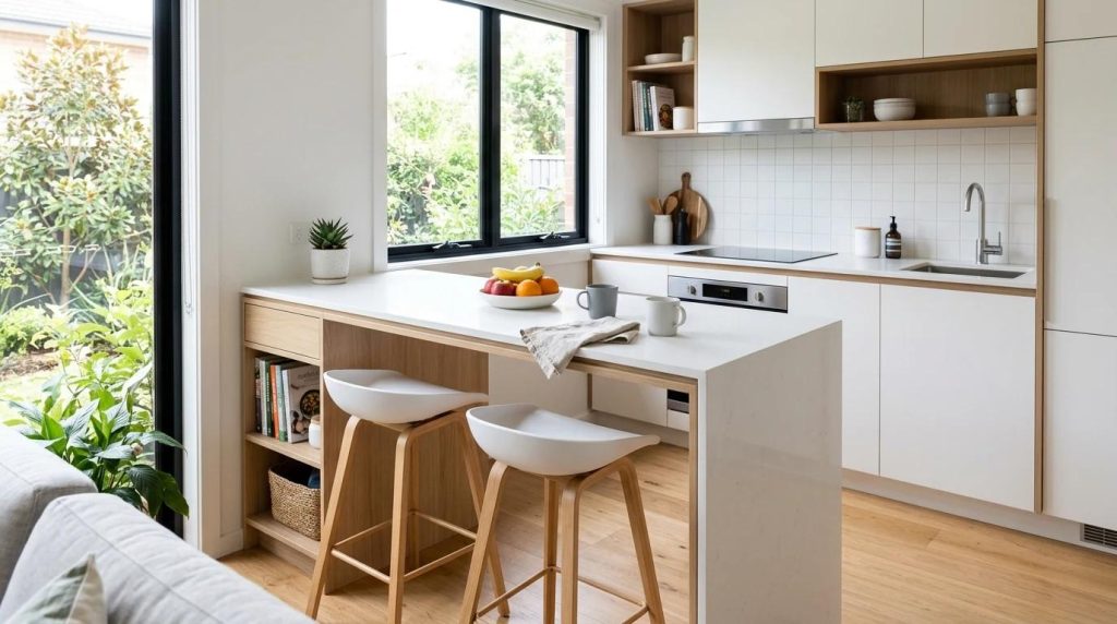
How to Test Kitchen Cabinet Colors Before You Order
- Get large samples. Small chips are not large enough to show how a cabinet color reads across a room.
- Place them vertically. Cabinet doors stand upright; testing a sample flat on a counter can distort the impression.
- Compare with real materials. Put the sample beside the countertop, backsplash, floor, and hardware—not against a blank wall alone.
- Check the planned lighting. Compare natural daylight and the actual LED products or representative samples you intend to use.
- Look at the whole palette. View the samples together from the kitchen entrance and adjoining living space.
- Confirm the production finish. Paint, stain, veneer, and clear coats may differ between manufacturers. Approve the actual finish sample before fabrication.
For paint inspiration, use the official color collections from Benjamin Moore and Sherwin-Williams, then test shortlisted colors in your own room. Online images are useful for narrowing options, but they cannot accurately predict how a finish will look under your lighting.
Cabinet Color Mistakes to Avoid
- Choosing a shade from a screen alone: photos and displays shift color.
- Ignoring undertones: a warm cabinet color can clash with a cool countertop even if both are attractive separately.
- Using too many competing patterns: coordinate strong stone veining with simpler cabinet and backsplash choices.
- Forgetting maintenance: some dark, high-gloss, or very pale finishes show fingerprints and marks more readily.
- Following a trend without context: a popular shade still needs to work with your home, daylight, and long-term plans.
- Approving only one wood door: natural timber varies, so review the expected range of grain and color variation.
Frequently Asked Questions About Kitchen Cabinet Color Ideas
1. What is the most popular kitchen cabinet color?
Warm white remains a versatile choice, while natural wood, earthy neutrals, greens, and blues are also prominent in design discussions. Popularity varies by region and style; the best color is the one that works with the kitchen’s fixed finishes and light.
2. Are white kitchen cabinets going out of style?
No single color disappears everywhere. White remains flexible and easy to coordinate, although many current designs use warmer whites, natural wood, or a contrasting island to add depth. Choose a white based on its undertone rather than assuming every white looks the same.
3. What cabinet colors make a small kitchen look bigger?
Warm white, soft ivory, pale greige, and light natural wood can help a compact kitchen feel bright. Consistent finishes and uncluttered sightlines also matter. A dark accent can still work when balanced with light surfaces and good lighting.
4. Are green kitchen cabinets a passing trend?
Muted greens such as sage and olive connect with natural materials and can be used in both contemporary and traditional kitchens. To make the choice more enduring, select a restrained shade and coordinate it with timeless counters, flooring, and hardware.
5. Which cabinet colors work best with white quartz countertops?
Warm white, oak, walnut, sage, navy, and many greige shades can work. The exact quartz pattern and undertone matter: compare cabinet samples with the actual slab or a large representative sample before deciding.
6. Do dark kitchen cabinets make a room look smaller?
They can feel visually heavier in a dim or crowded room, but they do not automatically make a kitchen look smaller. Natural light, contrast, cabinet layout, reflective surfaces, and lighting all affect the result. Consider using a dark color on the island or lower cabinets.
7. Should kitchen island cabinets be a different color?
They can be, but they do not have to be. A contrasting island creates a focal point when its color connects with another element in the room. Matching cabinets can create a calmer, more continuous look.
8. What cabinet colors are easiest to keep looking clean?
Visibility depends on the finish, sheen, lighting, and type of mark. Mid-tone colors and textured wood may disguise some everyday marks better than very glossy dark or very pale surfaces, but no finish is maintenance-free. Ask the manufacturer about cleaning and touch-up.
9. How do I choose between painted cabinets and natural wood?
Paint offers a broad color range and a more uniform appearance; natural wood brings grain variation and material character. Compare cost, finish durability, repair options, and how the material relates to the rest of the room before choosing.
10. Should cabinet color be chosen before the countertop and backsplash?
It is best to develop the palette together. If one material is already fixed, use it as the starting point. If everything is new, compare cabinet, countertop, backsplash, flooring, and hardware samples as a coordinated set before final approval.
Final Thoughts
The strongest kitchen cabinet color ideas are the ones that balance visual appeal with the practical realities of your home. Start with the materials and light you have, compare full-size samples, and choose a finish you are comfortable maintaining. Warm neutrals, natural wood, muted greens, blues, and thoughtful two-tone combinations all have a place when the undertones and proportions are right.
Before ordering custom cabinetry, confirm the final color and finish against the actual countertop, backsplash, flooring, and lighting samples. That simple step can prevent expensive surprises and help the finished kitchen feel cohesive rather than assembled from separate trends.